Optimizing web performance is a priority for any developer. One key aspect to consider is how images are handled across different devices. In this article, we will explore how to create responsive images with React. The goal is to display different images based on the screen size.
Why use different images for different devices?
When designing a web application or website, the user experience can vary depending on whether they’re using a smartphone, tablet, or desktop computer. Images, in particular, often make up a large portion of the web page’s weight. Using images optimized for the screen size not only reduces loading times but also improves user experience.
A classic example would be displaying a lighter, more compact version of an image on mobile, and a higher-quality (and often wider) version on desktop. This adapts the content to the device’s capabilities without unnecessarily burdening mobile users.
Native solutions
HTML provides elements that make handling responsive images easy. The <picture> element and the srcset attribute on <img> tags offer flexible solutions.
The <picture> element
The <picture> element allows you to define multiple image sources for different conditions (such as screen size or resolution). Here’s a simple example:
<picture>
  <source media="(min-width: 800px)" srcset="desktop-image.jpg" />
  <source media="(max-width: 799px)" srcset="mobile-image.jpg" />
  <img src="fallback-image.jpg" alt="Responsive image" />
</picture><source>allows you to define an image based on media conditions (screen size in this case).- If the screen width is greater than or equal to 800px, the
desktop-image.jpgwill be loaded. If it’s less than 799px,mobile-image.jpgwill be displayed. <img>acts as a fallback image if the defined sources do not load.
The srcset and sizes attributes
The second native tool is the srcset attribute for the <img> element, which allows you to define multiple images based on resolution or pixel density.
<img
  src="low-res.jpg"
  srcset="high-res.jpg 2x, medium-res.jpg 1x"
  alt="Responsive image with srcset"
/>
In this example, if the user’s device has a high pixel density screen (like a Retina display), the high-res.jpg image will be displayed. Otherwise, the medium-res.jpg image will be used.
Example with React
Native solutions are very efficient and integrate easily into a React project. Let’s see how to use these methods within a React application.
Example with <picture>
import React from "react";

const PictureExample: React.FC = () => {
  return (
    <picture>
      <source
        media="(min-width: 800px)"
        srcSet="https://cdn.pixabay.com/photo/2024/04/15/07/55/ai-generated-8697226_1280.png"
      />
      <source
        media="(max-width: 799px)"
        srcSet="https://cdn.pixabay.com/photo/2024/06/16/11/09/ai-generated-8833169_640.jpg"
      />
      <img src="https://cdn.pixabay.com/photo/2024/05/19/14/49/jester-8772764_640.jpg" />
    </picture>
  );
};

export default PictureExample;
This component works the same way as in the pure HTML example, but integrated into a React environment.
Example with srcset
import React from "react";

const SrcExample: React.FC = () => {
  return (
    <img
      src="https://cdn.pixabay.com/photo/2024/05/19/14/49/jester-8772764_640.jpg"
      srcSet="https://cdn.pixabay.com/photo/2024/04/15/07/55/ai-generated-8697226_1280.png 2x, https://cdn.pixabay.com/photo/2024/06/16/11/09/ai-generated-8833169_640.jpg 1x"
      alt="Image with srcset"
    />
  );
};

export default SrcExample;
Visual result
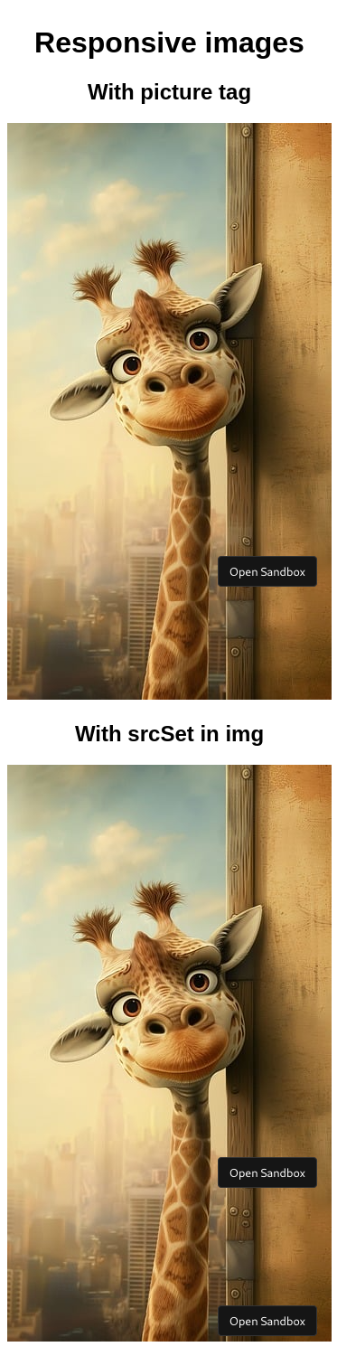
As you can see, both solutions display the mobile image https://cdn.pixabay.com/photo/2024/06/16/11/09/ai-generated-8833169_640.jpg
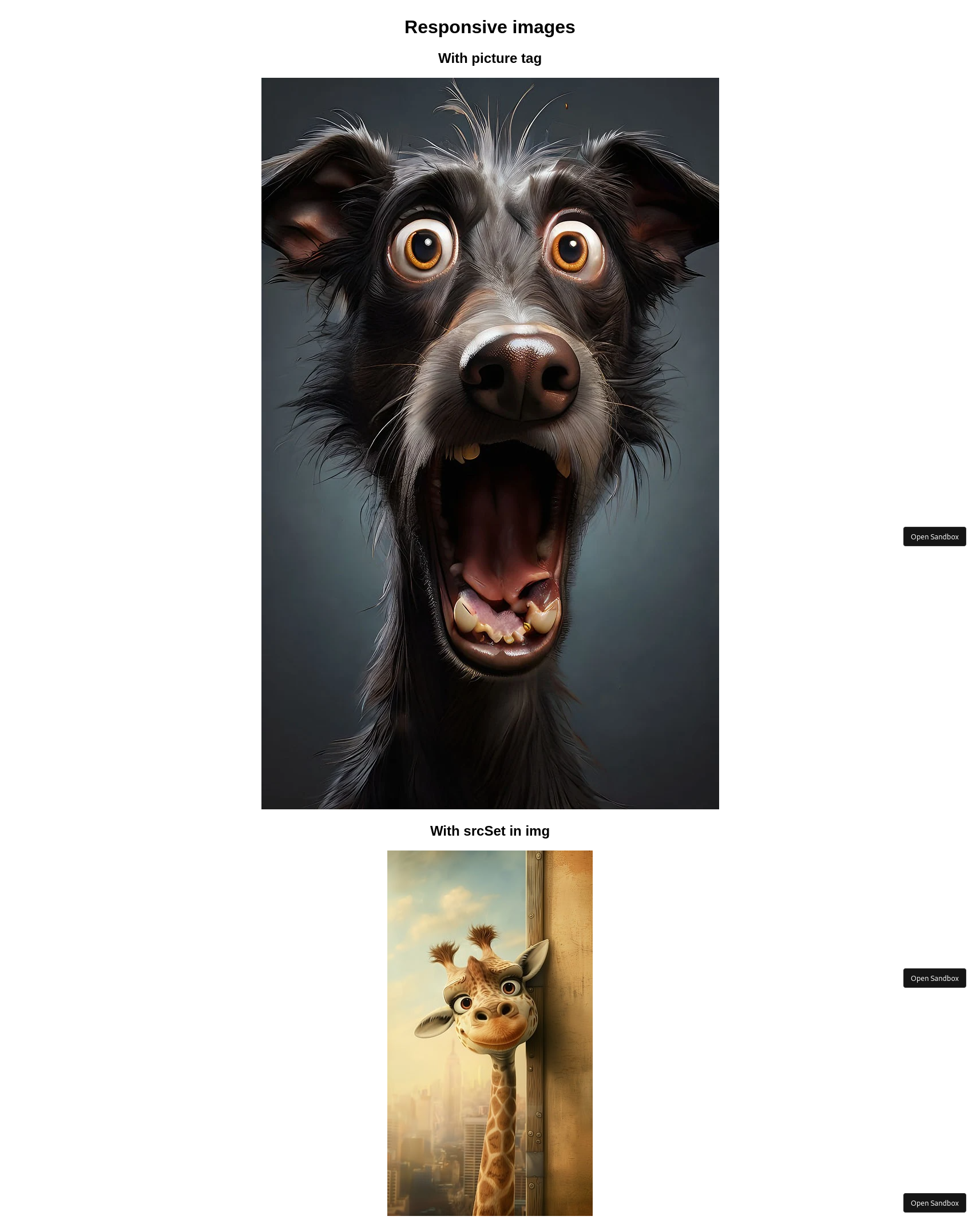
On desktop, the picture solution displays the desktop image desktop image, but the srcSet solution does not because I do not have a high-pixel-density screen and thus it stays on the mobile image.
Conclusion
Using native solutions for responsive images with HTML is not only efficient but also very easy to implement. The <picture> element and srcset allow you to optimize the user experience without excessive complexity. When integrated into React, you get the best of both worlds: optimal web performance and a modern application structure.
Your application’s performance can be significantly improved with these solutions, especially on mobile, by reducing loading times and tailoring resources to each user’s device.
You can find the source code on codesandbox.